
The Copilot Color Theory
A lot of people believe that the Copilot team spends its days deeply entrenched in data and algorithms. It’s true, we do. But that doesn’t just mean we’re mired in spreadsheets and equations all day. Actually, we invest a lot of time into brainstorming, experimenting, and exploring creative new ways to explain the power of AI.
Testing and learning is in our DNA. Every mistake is embraced as an opportunity for improvement. Our commitment to constant learning is very much reflected in our ever-changing color palette, which has evolved over the last year from a handful of default Tableau colors to a custom palette built around the needs of our users.
A lot of thought goes into making sure we use the right colors to communicate the story of our AI — it’s much more than just a marketing team adding a new hex code to the brand deck. Here’s the story of how the Copilot color palette evolved to its current state, and what we learned along the way.
Where We Started
Before we had a dedicated data visualization team, we still had visualization needs, of course (like any team that has its hands on data and wants to use it to make decisions).


At that time we were mostly building dashboards in Tableau for our internal needs, such as monitoring or testing features, but we also had some simple visualizations in our UI to show delivery and performance across the campaign.

Most of our visualizations were time-series based; lots of bar charts, line graphs, and area graphs — the bread and butter of data viz. For the visualization colors we primarily relied on Tableau defaults or, when we had the option, the color palette of our parent brand, Xaxis. Since our dashboards were for our own internal trader use, we put more emphasis on simplicity than aesthetics.
New Color Opportunities
As Copilot’s technology became more sophisticated and complex, so too did our visualization needs. We realized we needed a data visualization team that could fully focus on translating these complexities into visual formats. This new data visualization team would have two main goals:
Translate our clients’ data to actionable insights.
Visualize our algorithms so that both our traders and clients could understand what happens “behind the scenes.”

One of the first big projects we tackled was a visualization of a complex clustering model that grows over time. The account teams had gotten pretty good at describing the model, but we knew that words could only go so far. Adding color and shape to the explanation was the best way to really show what’s happening.

Similarly, we built an A/B Insights feature to visually compare two flights and see how they differ in performance and delivery.
The greater complexity of these new visualizations brought with them some new color challenges. We needed additional colors to represent:
Differences between two different flights (“A” vs “B”).
Scenarios where there is no data, i.e. data vs. no data colors.
A range of performance values from “good” to “bad.”
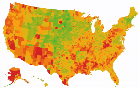
Let’s focus on that last point for now — encoding performance. To understand the challenges of visualizing that data, look at this color-coded cost per click (CPC) performance map of the US.

Our First Stab

With the marketing team’s color palette as a starting point, we decided on a continuous green → yellow → red scale for encoding performance.
The strongest aspect of this color scale is that it is familiar. This type of green-is-good, red-is bad, and yellow-and-orange-are-somewhere-between encoding is used in many places, from traffic lights to the stock market.
But the major drawback to this choice is that it is not accessible to everyone; this visualization could be hard to read for individuals with certain types of vision deficiencies.
Ultimately, we decided to build a new color palette from the ground up. But we weren’t going to approach it arbitrarily or base our output solely on aesthetics — we needed to dig into the fundamentals of how color is used to communicate data and determine how to best use those principles to serve our needs and our clients’ needs.
Back to the Drawing Board: Find the Right Type of Color Scale
One of the first steps in landing on the right colors is deciding what kind of scale should be used. Color scales used in data visualizations typically fall into one of three buckets — divergent, sequential, or qualitative. You can read more here, but here’s a quick overview of how the three scales are used:
1. Qualitative scales use a range of distinct colors to represent unique variables that have no inherent order. As an example, think of a pie chart that shows people’s favorite ice cream flavors. Mint Chip and Chocolate will have unique colors on the chart but have no specific relation to each other.

2. Sequential scales typically have a single hue which varies in saturation and/or luminosity. These are used when the values for each color are inherently ordered or are numeric, such as a population density map where darker hues represent highly populated regions and lighter hues represent the sparser areas.

3. Diverging scales are used only when there is a meaningful central value in your range of data, like an average or mean. Typically, that center value would have a neutral color, and the values to one side (representing data points below that point) would share one hue, while the values to the other side (data points above the central value) would have another distinct hue, to help distinguish both ends of the spectrum. These are useful for showing how a range of results compares against a central value — for example, a bar graph that displays customer satisfaction ratings relative to a specific benchmark.

In our case, we can immediately throw out qualitative because we’re dealing with ordered, numerical data. That leaves us with either sequential or diverging.
If we were to use a sequential scale, only one “end” of our data values would be highlighted (e.g. if we made it so that values with a higher CPC were the darkest shade, then those DMAs would stand out, but not the DMAs with the lowest CPC). For our purposes, we care about both the high and low values — the good and bad CPC results — so a sequential scale isn’t exactly right.
In most cases, we tend to have a “middle value” that is important to us, which all other data should be compared to (such as a mean CPC value). So a diverging scale makes the most sense for our visualization.
Consider Colorblindness
On the Copilot team, we believe in making advertising better for everyone. That means everyone.
Red-yellow-green color scales are not accessible to many people with color vision deficiencies (CVD). According to colorblindawareness.org, “CVD affects approximately 1 in 12 men (8%) and 1 in 200 women in the world,” with red-green being the most common.
During our color research, we came across a tool called Colorblindly, an extension that simulates the experience of colorblindness for developers so they can build websites that work better for people with color vision deficiencies.
The two maps below show how the red-to-green CPA visualization would look for users with trichromacy (“normal” color vision), followed by a simulation of how it might look to users with CVD.


It was clear we needed to update the hues at each end of the scale.
We leaned into an app called ColorBrewer to make our map palette more accessible and ended up with a diverging color scale with pink and green at each end.

Finally, we’d picked the perfect palette.
NOT!
Adjust as Needed
As I mentioned, building a color scale has been a process.
While we were successful in highlighting good and bad performing objects with our pink and green color palette, we neglected to take the visualization context into account. We noticed that objects with values closer to the mean are hard to distinguish because of the low contrast between the light colors and our white UI background. Furthermore, at the point where the color changes from pink to green, it appeared as if there was a big change in value, even when the colors were very close to the mean.

To address these issues, we decided to:
Add a neutral ninth grey color in the center to make the value transition smoother.
Reduce the overall brightness of the palette to make the neutral colors more visible.
We changed our divergent scale from:

To:

Before

After
The last step will be to build out a set of data visualization style guidelines which would include best practices on accessibility, diverging vs sequential scales, and more. Documenting our standards and learnings will help us build more consistency across our visualizations, whether they live in the app, on Tableau, or within a slide deck.
Our users are giving us very positive feedback on these new visualizations so far, but we’re never done trying to improve it. As Copilot continues to integrate more and more data and data-driven insights into the platform, we’ll continue to refresh our approach to representing all of that information through clear, compelling, appealing visualizations.
Suggested Articles
Tobias Sutters
The Making of Copilot Insights
In October of 2020, the Copilot team embarked on a journey of reimagining Insights through the lens of machine learning and data visualization. See the steps we took to build the newly launched Copilot Insights package - all from our homes during the pandemic.